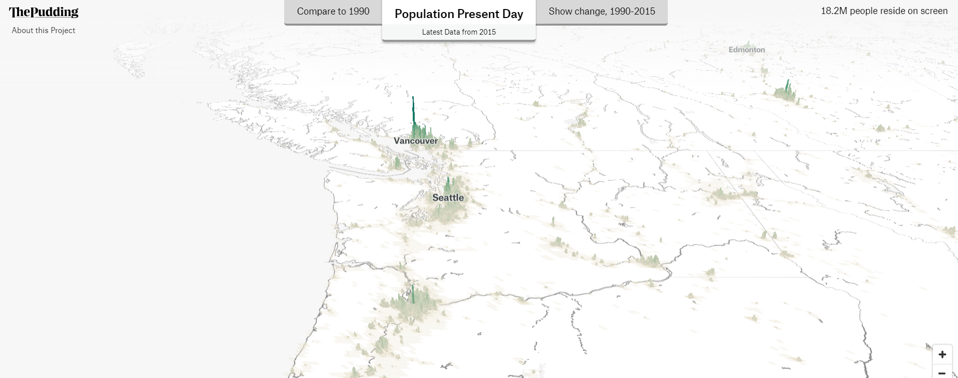
A new interactive map conveys the population change and density of the Cascadia bioregion and world over the past 20 years in 3d, as a new layer of human terrain.

Check out this cool interactive map at: https://pudding.cool/2018/10/city_3d/
The map uses the new Global Human Settlement Layer: an amazing global population dataset that is free and open source that was released at the recent Habitat III conference on housing and sustainable development in Quito, Ecuador (17-20 October 2016). The Cascadia portion, is just a small part of the entire world which can be travelled to, with the goal of helping visualize the numbers and density of our worlds current population.
As part of the release - Landsat data from 1975, 1990, 2000 and 2014 were processed and analysed in order to produce three different GHS products: one on population (GHS-POP), one on built-up areas (GHS-BUILT) and one city model dataset (GHS-SMOD).
An Introduction to Bioregional Mapping:
This type of mapping is also very important into what we call bioregional mapping. Maps are powerful tools. They can be used by a community for self-empowerment and to (re)develop a sense of place and a connection to the land. They can be tools of resistance, of education or of identity. They can be presented and distributed through schools, community meetings, museums, libraries and so on. By creating our own maps through democratic and community processes from the ground up — we create new perspectives on how we view the world that reflects what we wish to show, rather than views that are imposed from above, or that reflect lines and boundaries of traditional nation state narratives.
Most importantly — maps help us relate to the places we inhabit, and can change our perspective on how we live, and how we interconnect with one another. If we have no vision of the world we want to work towards, we are left in a reactionary position, with no unified pathways forward.
From the book Giving the Land a Voice:
“The atlas should be used as a jumping off place for decision making about the future. From the wholistic image of place that the maps collectively communicate, what actions could be adopted to achieve sustainable prosperity? What priorities emerge from a survey of damaged lands and unsolved social ills? What underutilized potentials can be put to work to help achieve sustainability? The atlas can become a focus for discussions setting a proactive plan for positive change.”
It’s all about the Pudding
This particular map and article was created by Matt Daniels at the Pudding. The Pudding is a very cool website that explains ideas debated in culture with visual essays. By wielding original datasets, primary research, and interactivity, we try to thoroughly explore complex topics. They also have a great range of other essays that can be found here. Visual essays are an emerging form of journalism. Some of the most complex, debated topics get lost in “too long; didn’t read” 10,000-word articles. Visual storytelling makes ideas more accessible—or so goes the adage “a picture is worth a thousand words.”
Matt also has an excellent essay on how we use data visualization like this to perceive the world.
Changing our Perspective on how we see the world
At it’s most basic, these maps change the way we see the world. For example, this map of density:
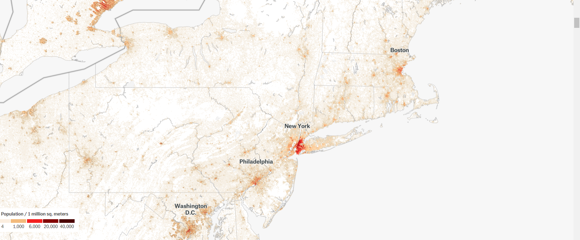
look very different than
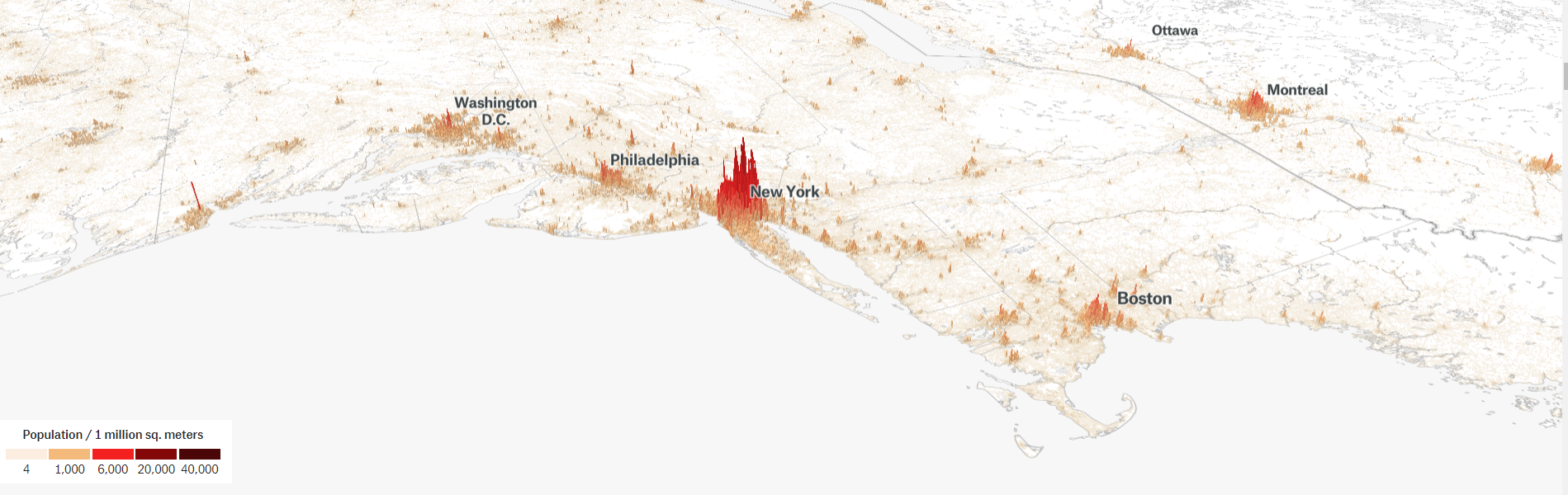
These Changes can be summed up well by the author Matt Daniels who writes
“When I first saw a city in 3D, I had a feel for its population size that I had never experienced before… In 1993, there were 14 cities with over 10 million people. Today, 20 additional cities qualify (and another 11 will by 2030), with many sprouting from farmland in our lifetimes. Unless you’ve visited one of these new cities of 10 million people or tracked its growth closely, its scale can be hard to envision. Among them is Kinshasa, Democratic Republic of Congo (13.1 million people), which I now know to be bigger than historically populous cities (see my article on Kinshasa’s airports vs. other cities’). I saw it outrank Paris (11 million people) in population bar charts and data tables. Yet it wasn’t until I saw the population as a form, rather than a number, that I could appreciate how large Kinshasa had become.”
These maps also then change how we perceive the world:


For more information and other great articles, check out the Pudding Here.
If your are a GIS cartographer, looking to learn more about the open source Human Terrain Layer data sets - this article provides a nice tutorial.
